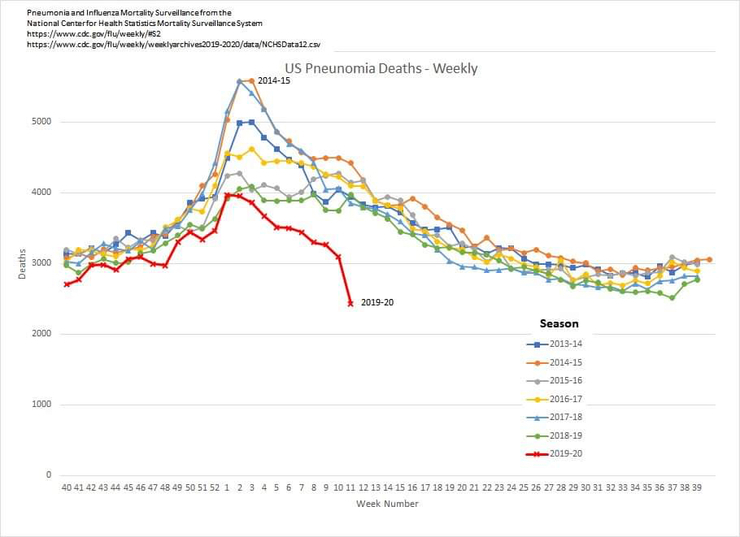
Check out the dates on this graph...
Am I the only person who finds this CDC graph of weekly US influenza and pneumonia deaths by year rather odd?
 4
4


Be part of the movement!
Welcome to the community for those who value free speech, evidence and civil discourse.Create your free account
9 comments
Feel free to reply to any comment by clicking the "Reply" button.They obviously haven't added pneumonia related deaths if cause by covid to this years numbers. Just another example of why i research to the heart of matters, check whst both sides say (since both sides conveniently have stats to back their positions). I tend to believe in Hunter S Thompsons view that there is no objective media and we should stop pretending. Still, thanks for the graph.
 char1emagne
Level 4
Apr 14, 2020
char1emagne
Level 4
Apr 14, 2020
0
Made some research on data from
In the week from april 5-12 the number of "Corona-deaths" went from 9636 to 22105, that means 12469 deaths last week.
In a normal year 3000 "flu-deaths" could be expected, so what's the problem?
Seem that we have a problem beyond normality!
0
Well, it seems this odd graph is due to reporting lag.
 henrydz
Level 6
Apr 13, 2020
henrydz
Level 6
Apr 13, 2020
0
I would say that the data on 2019\20 isn’t all in and tabulated so there’s more than likely to be some changes ... adjustment ... but ...
The chart seems to bear out what has been being said right along ... the overflow “hospitals” are going mostly unused, all the “extra” equipment is finding little usage.
The “safe spacing” and “shelter in place” orders are producing results unlike we’ve ever experienced during Flu Season (note that this chart is specifically “pneumonia deaths” so ... COVID-19 Deaths as well ... unless they’re holding those numbers aside for some reason)
It looks, from this chart (though my faith in the CDC is a bit shaken) that we have done a “splendid” job of “saving lives” but ... at WHAT COST?
 Bay0Wulf
Level 8
Apr 13, 2020
1
Bay0Wulf
Level 8
Apr 13, 2020
1
I checked this out earlier and the explanation I found was that all deaths with Covid symptoms have to be assumed as Covid deaths at the time of death. Testing can take days and lab reports come back after the death certificates are signed. This is in order that the Covid death totals are not underestimated. This should be made public information along side of Covid death totals. But then the big numbers and the curve are our current scripture. The curve will tell us everything we need to know. Keep your eyes on the curve.
 Julie6100
Level 6
Apr 13, 2020
Julie6100
Level 6
Apr 13, 2020
0
Well ... yes but ...
The chart covers the generic “pneumonia” deaths ... not specifically “Flu” or “COVID-19” but “pneumonia” ... which covers both.
Covid19 is more akin to SARS than to an influenza strain - very different viruses.

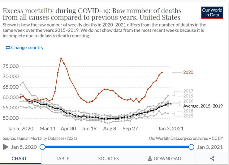
You're not the only one. And check out total mortality compared to previous years - it's lower than usual.
 Kosakarika
Level 2
Apr 13, 2020
Kosakarika
Level 2
Apr 13, 2020
0

Be part of the movement!
Welcome to the community for those who value free speech, evidence and civil discourse.Create your free account
Share this post
Categories
Slug does not evaluate or guarantee the accuracy of any content. Read full disclaimer.